Editorial Product Landing Page
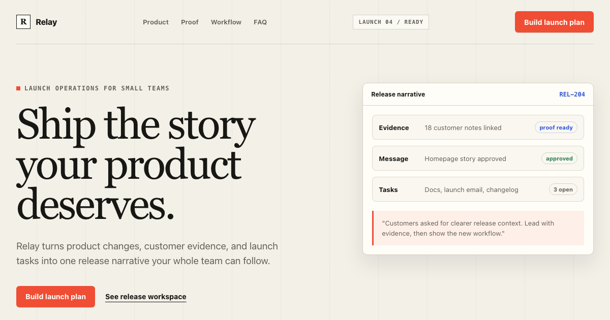
A complete conversion system for product launches: warm editorial composition, signal-red action hierarchy, product evidence, section rhythm, copy limits, and mobile rules.
Preview
ImageFreeOpen the full preview to inspect theme and responsive behavior.
Agent prompts
Apply or remix the reference
View prompt source
# Implement Editorial Product Landing Page

Read DESIGN.md before changing UI. Treat it as the visual source of truth for the existing application.

Goal: apply this reference to the current product without replacing its domain model, routes, auth, data fetching, or business logic.

Implementation rules:
- Inspect the current app and identify the smallest safe surface to update.
- Reuse the existing component primitives when they already exist; build missing primitives to match, keeping them accessible.
- Use the DESIGN.md tokens for color, typography, spacing, radii, elevation, density, and responsive behavior.
- Implement every important state in the reference: loading, empty, error, success, focus, disabled, and destructive confirmation.
- Keep real semantic HTML, keyboard navigation, visible focus, and responsive behavior.
- Verify the result at desktop and mobile widths before shipping.

Reference-specific direction:
Read DESIGN.md and implement this as an editorial product landing page. Preserve the asymmetric hero, display/body type contrast, 12-column composition, signal-red CTA hierarchy, proof-first section rhythm, responsive copy limits, and one primary conversion action per section.
# Remix Editorial Product Landing Page

Use the existing Editorial Product Landing Page implementation and DESIGN.md as the baseline. Make a deliberate visual variation while preserving the information architecture, accessibility, and component behavior.

Change only the requested direction:
- Keep the existing layout hierarchy, content priority, responsive rules, and interaction states.
- Preserve the token contract; add named tokens instead of arbitrary one-off values.
- Keep the primary action, table/card density, navigation, and status semantics clear.
- Do not introduce gradients, excessive shadows, random rounded cards, or generic dashboard styling unless explicitly requested.
- Show the changed states in the preview and explain which tokens/components changed.

Requested remix: [describe the visual direction, brand, or product context here]

Reference-specific guardrails:
Read DESIGN.md and implement this as an editorial product landing page. Preserve the asymmetric hero, display/body type contrast, 12-column composition, signal-red CTA hierarchy, proof-first section rhythm, responsive copy limits, and one primary conversion action per section.
Conversion system overview
Editorial energy, conversion discipline
The system combines expressive launch storytelling with strict conversion hierarchy. Large display type establishes the promise; compact proof, product evidence, and repeated single-purpose actions move the reader through the page without turning every section into a card.
Relay is fictional preview content. The reusable contract is the page rhythm, type pairing, signal-red action hierarchy, product evidence treatment, copy limits, media rules, and responsive marketing states.
Display headline
Ship the story your product deserves.
CTA hierarchy
One filled action per section. Secondary actions remain quiet text links.
Product evidence
Page anatomy
Full landing sequence
The template defines the whole conversion path, from navigation to footer. Each step has purpose, density, responsive behavior, and a known failure mode.
01Navigation
Compact
Orient the visitor and expose one primary action.
Five equal nav actions with no conversion hierarchy.
02Hero promise
Spacious copy, dense media
State one concrete promise and show product evidence.
Generic centered SaaS hero with hidden product UI.
03Social proof
Compact
Make the main promise feel earned before asking for trust.
Unlabeled fake logo boxes.
04Product evidence
Medium
Show how evidence, tasks, and messaging connect.
Screenshot too small to inspect.
05Feature narrative
Medium
Explain the mechanism behind the promise.
Three identical icon cards.
06Testimonial
Spacious
Humanize the workflow with a specific result.
Anonymous wall-of-text testimonial.
Typography
Editorial display, practical body
Hero Display
4.75rem / 0.95 / 500
Ship the story your product deserves.
Tracking -0.02em. Keep line length controlled for mobile.
Section Display
2.875rem / 1.02 / 500
From scattered launch tasks to one clear release narrative.
Tracking -0.015em. Keep line length controlled for mobile.
Feature Headline
1.75rem / 1.1 / 600
Turn evidence into release messaging
Keep line length controlled for mobile.
Testimonial Quote
2.125rem / 1.18 / 500
Trusted by small teams with ambitious release cycles.
Keep line length controlled for mobile.
Body Large
1.1875rem / 1.55 / 400
Relay connects evidence, tasks, and messaging in one launch workspace.
Keep line length controlled for mobile.
Body
0.9375rem / 1.65 / 400
Start building your next launch.
Keep line length controlled for mobile.
Navigation / UI
0.8125rem / 1.2 / 600
Product
Keep line length controlled for mobile.
Eyebrow / Annotation
0.75rem / 1.2 / 700
LAUNCH 04
Tracking 0.12em. Keep line length controlled for mobile.
CTA Label
0.875rem / 1 / 700
Build launch plan
Keep line length controlled for mobile.
Mono Metadata
0.75rem / 1.4 / 600
REL-204 / READY
Keep line length controlled for mobile.
Marketing components
States that a real landing page needs
CTA button
Use scale 0.96 on press Preserve width during loading Focus ring uses Evidence Blue
Product media frame
Frame with Surface and Rule Caption below media Never hide product behind decoration
FAQ row
Use button semantics Expose aria-expanded Maintain 44px touch target
Waitlist input
Label remains visible Errors are specific Success explains the next step
Copy system
Voice and conversion copy
The template keeps claims concrete and makes each CTA describe the real outcome.
Good
- Turn every product release into a story customers can follow.
- Connect evidence, tasks, and messaging in one launch workspace.
- Build launch plan
Avoid
- revolutionize
- supercharge
- next-generation
- seamless
- unlock the power of AI
Media and conversion
Guardrails for the AI agent
Media rules
- Show real product UI when claiming workflow clarity
- Use abstract composition only for proof labels or issue markers
- Crop screenshots around the active release timeline
- Place captions below media
- Use 10px media radius and a thin Rule outline
- Mobile crops preserve labels and primary task state
Conversion rules
- One primary conversion action per section
- Proof appears before the visitor has to trust a large claim
- Primary CTA uses Signal Red and should not compete with another filled button
- Evidence Blue is reserved for product proof and selected data
- Final CTA repeats the highest-intent action with reassurance
- Secondary actions are text links or quiet outlines
Do
- State one concrete promise in the hero
- Make product evidence visible in the first viewport
- Use one primary conversion action per section
- Alternate narrative density intentionally
- Keep body copy to readable line lengths
- Pair claims with proof
- Use display type selectively
- Preserve a strong mobile reading order
Don't
- No generic “Build faster, ship smarter” copy
- No purple gradients because the page is SaaS
- No every-section-inside-a-card layout
- No repeated centered layout from top to bottom
- No fake logos without text labels
- No six-line mobile hero headlines
- No two equal primary CTAs beside each other
- No arbitrary Tailwind colors
Source file
Raw DESIGN.md and export formats
This is the single canonical source view. Anonymous visitors see a short preview; signed-in users get the complete Markdown and generated implementation formats.
# Editorial Product Landing Page DESIGN.md

## Template intent

Build an editorial product landing page for Relay, a fictional launch-operations product for small
product teams. The page should turn scattered product changes, customer evidence, launch tasks, and
message drafts into one clear release narrative.

This is a full landing-page system, not a hero-only template. It defines the page anatomy,
conversion hierarchy, copy rules, media behavior, responsive composition, accessibility states, and
implementation tokens needed for Cursor, Claude Code, or Codex.

## Visual thesis

Editorial launch system with signal red.

- Use warm paper instead of pure white.
- Use deep carbon ink instead of generic slate.
- Use signal red for the one primary conversion action in each section.
- Use evidence blue only for product proof, metrics, and data evidence.
- Let typography and asymmetry do the work before decoration.
- Keep controls square or lightly rounded.
- Use thin rules, proof labels, issue numbers, and annotations.
- Show product evidence in the first viewport.
- Do not add gradients, glassmorphism, random floating pills, or AI sparkle decoration.

## Page anatomy

1. Navigation
   - Purpose: orient the visitor and expose one primary action.
   - Anatomy: wordmark, compact links, product status label, primary CTA.
   - Primary action: Build launch plan.
   - Mobile: collapse links behind a menu; keep CTA visible or inside the first menu row.
   - Failure: a centered nav with five equal actions and no hierarchy.

2. Hero promise
   - Purpose: state one concrete promise and show product evidence.
   - Anatomy: eyebrow, H1, body copy, CTA pair, proof label, launch desk media.
   - Primary action: Build launch plan.
   - Density: spacious text, dense media.
   - Mobile: copy before media, two CTAs stacked only when width requires it.
   - Failure: vague "Build faster, ship smarter" copy with hidden product UI.

3. Social proof
   - Purpose: make the main promise feel earned before asking for trust.
   - Anatomy: proof label, monochrome team names, one metric, accessible text fallback.
   - Primary action: none.
   - Mobile: wrap names into two columns.
   - Failure: fake logo shapes with no labels.

4. Product evidence
   - Purpose: show how evidence, tasks, and messaging connect.
   - Anatomy: screenshot frame, release timeline, customer quote, task lane, caption.
   - Primary action: See the workspace.
More templates
Related templates
Explore other ready-to-use DESIGN.md templates for your next project.
 $39
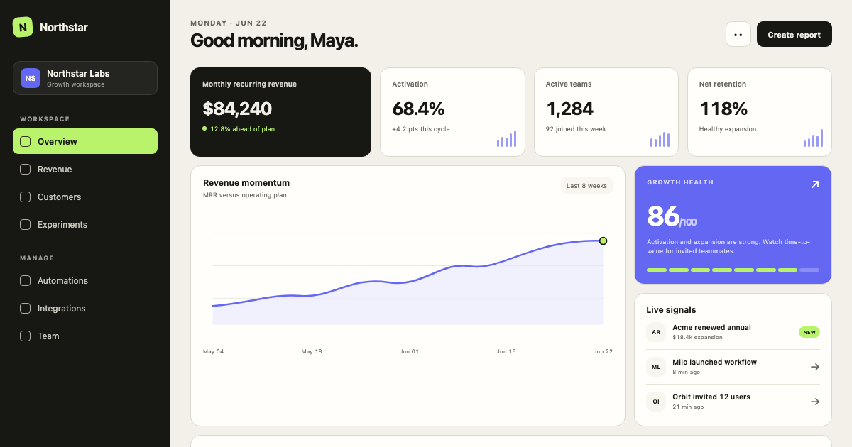
$39Minimal SaaS Dashboard
A calm, data-dense SaaS operating system with warm neutral surfaces, graphite navigation, electric signal accents, and a strict 4px grid.
 $39
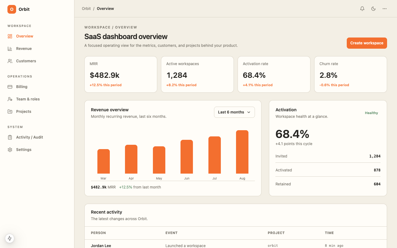
$39SaaS Dashboard
A ready-to-code SaaS dashboard starter with responsive metrics, customer operations, revenue views, and a warm operational data interface with orange and green signal colors.
 $29
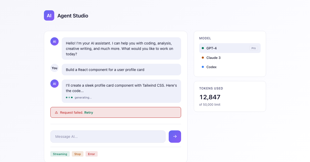
$29AI App Starter
A dark-first DESIGN.md for AI apps: deep space canvas, an indigo-to-violet brand gradient reserved for generative moments, calm neutrals, and streaming-aware states.
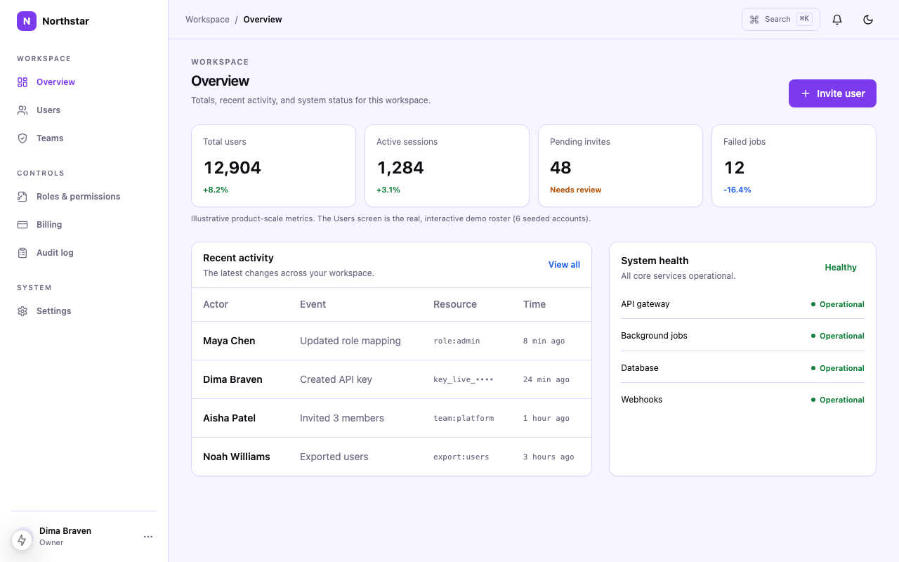 $49
$49Admin Panel
Admin Panel DESIGN.md for Cursor, Codex, and Claude Code: Light + Dark themes, responsive table rules, semantic states, and Tailwind-ready exports.
More resources
Need to know
Frequently asked questions
Practical answers about this template, its implementation scope, and the source bundle.