Tailwind CSS design system file
Tailwind CSS DESIGN.md for AI coding agents
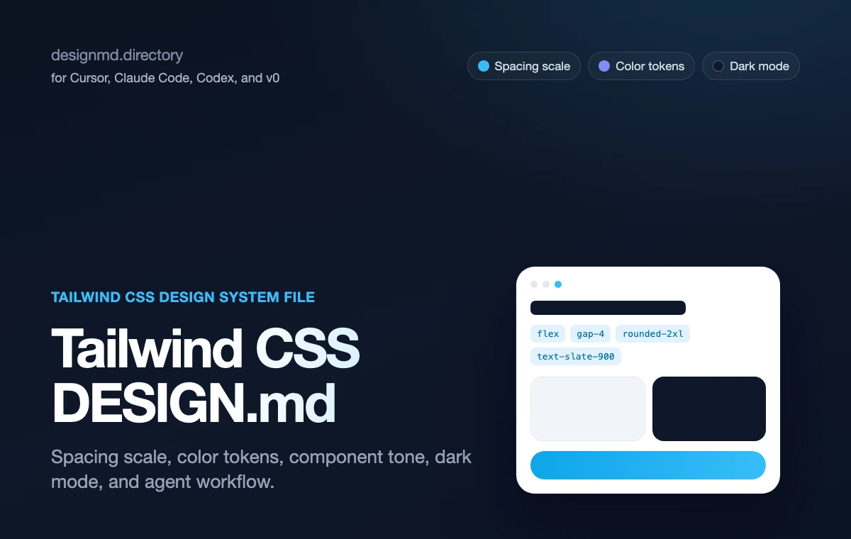
A practical design contract for agents styling with Tailwind CSS utility classes. It defines the spacing scale, color tokens, radius, component tone, and prompt-ready constraints so generated UI stops looking like default Tailwind.
Why it matters
Why Tailwind CSS needs DESIGN.md
A reference file gives the agent durable decisions to apply — and a boundary for what to avoid.
Components
01Tailwind CSS gives teams a utility-class engine, but utility classes alone do not encode brand taste, spacing rhythm, or component tone.
Product taste
02DESIGN.md gives those utilities product taste: a real spacing scale, color token map, radius rhythm, dark mode rules, and anti-patterns.
Agent consistency
03Agents need both. Without a DESIGN.md file, they can write valid Tailwind classes while still composing a generic, unstyled-feeling layout.
Scope
04The reference is intentionally independent. It points agents to the official Tailwind CSS documentation for utility syntax and to local DESIGN.md rules for product-specific decisions.
Color System
Brand palette extracted from the design system. Click any swatch to copy the hex value.
Text / Primary
#101828
Accent
#e11d48
Surface / Background
#fff1f2
Border / Subtle
#fda4af
Typography Specimen
Display
2.8rem / 700 / 1.04
The quick brown fox
Heading H1
2rem / 700 / 1.1
The quick brown fox jumps
Heading H2
1.5rem / 600 / 1.15
The quick brown fox jumps over
Heading H3
1.125rem / 600 / 1.2
The quick brown fox jumps over the lazy
Body
1rem / 400 / 1.5
The quick brown fox jumps over the lazy dog
Small / Caption
0.75rem / 400 / 1.5
The quick brown fox jumps over the lazy dog and sat down.
Monospace
const primary = "System";
Layout & Spacing Tokens
Spacing Scale
Border Radius
Elevation & Shadow
Raw DESIGN.md File
The full source file in Markdown format, plus export variants for Tailwind config, CSS variables, and design tokens. Sign in to copy or download the full file.
# Tailwind CSS DESIGN.md

## What this is
Tailwind CSS is a utility-first framework: classes compose directly in markup instead of hand-written stylesheets.

DESIGN.md helps agents turn that utility vocabulary into a consistent product system instead of a pile of arbitrary one-off classes.

## Why this page exists in DesignMD
This reference is not a scraped brand style page. It is a workflow page for teams that want to pair Tailwind CSS theme documentation with a durable DESIGN.md file.
Use it when an AI builder needs visual taste before it edits Tailwind classes, creates React components, or turns a prompt into a working interface.
The goal is practical: make the agent read a small design contract before it starts guessing color, density, hierarchy, radius, and component behavior.

## How DESIGN.md fits the workflow
- Define the spacing scale and color tokens before asking an agent to build a screen.
- Document radius, shadow, and border rhythm so generated UI does not default to rounded-lg everywhere.
- Tell agents which utility patterns are canonical for buttons, cards, and forms.
- Explain dark mode strategy (class vs media) so agents do not hardcode one-off dark colors.
- List anti-patterns so agents stop inventing arbitrary values like `p-[13px]`.
- Keep DESIGN.md close to the source code, usually in the project root or beside the frontend app that owns the product surface.
- Treat the file as a living design contract. Update it after visual decisions change, not only after a full redesign.
- Reference the file explicitly in your coding-agent instructions so it is read before UI work begins.
- Prefer concrete values over adjectives. Agents follow `--radius-card: 8px` more reliably than "make it polished".
- Pair visual rules with acceptance checks: responsive behavior, hover states, empty states, error states, and accessibility.

## Recommended DESIGN.md structure
A useful DESIGN.md for this workflow should be readable by a human reviewer and precise enough for an agent.

### Product feel
- Define the product category and emotional target in one paragraph.
- Name what the interface should avoid, not only what it should become.
- Include the density target: sparse marketing, focused SaaS, data-heavy console, or code-first tool.

### Color
- Put canonical color values in CSS variables or token names.
AI-agent workflow
Read DESIGN.md with AGENTS.md before editing UI. Preserve local imports, responsive behavior, and accessibility.
Related pages and guides
7 references
REFERENCE
Tailwind DESIGN.md
Templates, references and the Tailwind guide.
TEMPLATE
Tailwind DESIGN.md template
A starter file for color tokens, radius, spacing, shadows, and component tone.
GUIDE
DESIGN.md for Tailwind guide
The educational guide for writing Tailwind-specific design memory.
REFERENCE
shadcn/ui DESIGN.md
A related component-system reference for building agent-generated UI with shadcn/ui.
REFERENCE
Vercel DESIGN.md
A related devtool reference for monochrome AI-built interfaces.
WORKFLOW
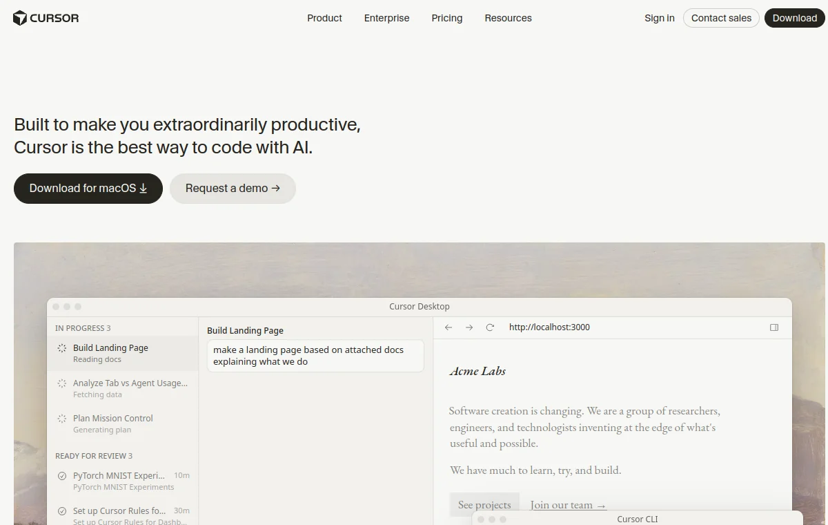
Cursor DESIGN.md
A related agent workflow page for applying Tailwind rules in Cursor.
WORKFLOW
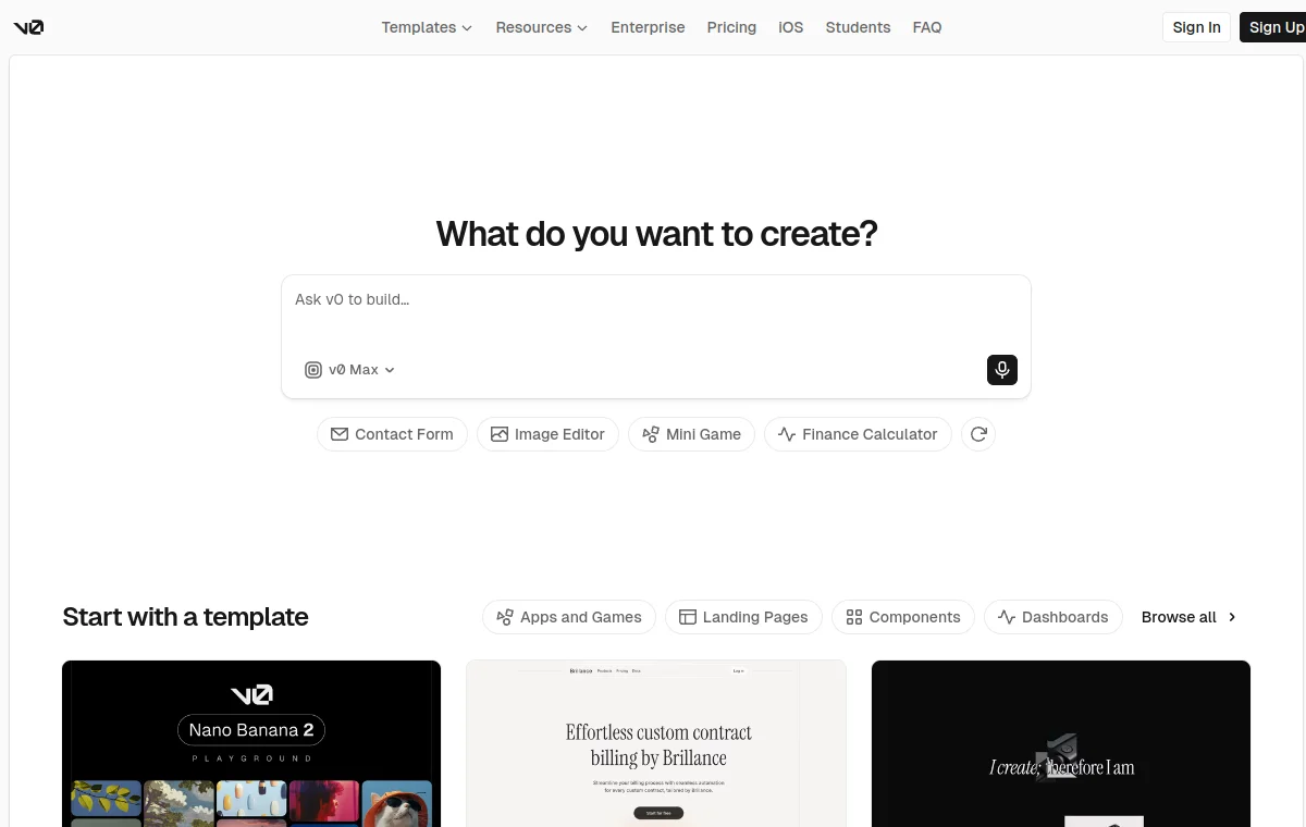
v0 DESIGN.md
A related workflow page for generated React, Tailwind, and shadcn UI.
Related Tailwind, shadcn, Vercel, and Cursor pages
Tailwind DESIGN.md template
A template style file for Tailwind apps: color tokens, radius, spacing, shadows, and component tone.
shadcn/ui DESIGN.md
A practical design contract for AI agents using shadcn/ui: component rules, Tailwind tokens, density, states, forms, tables, dashboards, and prompt-ready constraints.
Vercel
Vercel design system as a DESIGN.md — monochrome Geist UI, electric-blue accent.
FAQ
What is a Tailwind DESIGN.md?
It is an independent markdown reference that tells AI coding agents how to use Tailwind CSS utility classes with product-specific rules for spacing, color tokens, radius, component tone, and dark mode.
Is this official Tailwind Labs documentation?
No. This is an independent DesignMD reference for AI-agent workflows. Use the official Tailwind CSS documentation for utility syntax and configuration details.
How do I use it with Cursor or Codex?
Copy the DESIGN.md file into your project, point Cursor or Codex at it before UI work, then ask the agent to reuse the documented spacing scale, color tokens, and component tone instead of inventing new arbitrary values.
Does it work with shadcn/ui?
Yes. Tailwind CSS is the styling layer under shadcn/ui, so the spacing and color token conventions here translate directly into shadcn component variants. See the shadcn/ui DESIGN.md reference for the component-specific rules.