shadcn/ui
DESIGN.md for shadcn/ui
How to keep shadcn/ui fast without letting your product feel generic.
 Dima Braven8 min read
See it in practice
Related DESIGN.md references
Curated directory entries with practical workflows and visual contracts — not blog posts.
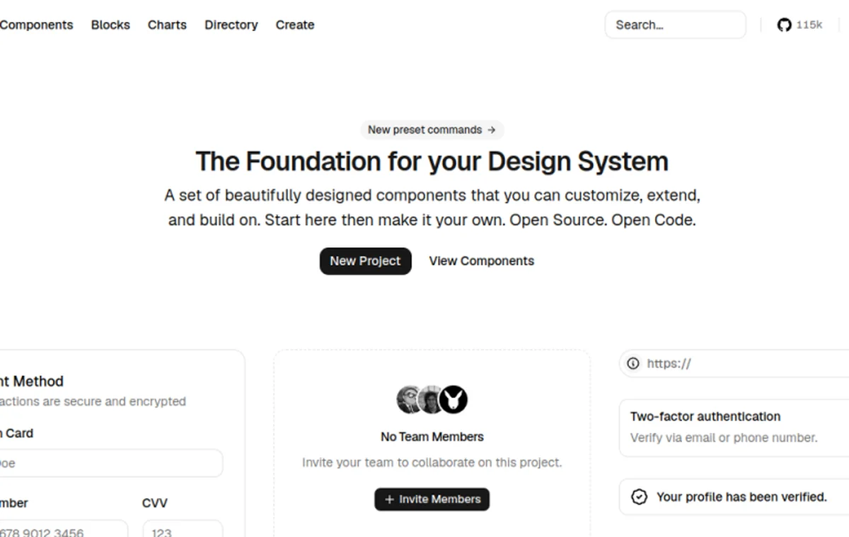
Why shadcn/ui alone is not enough for AI agents
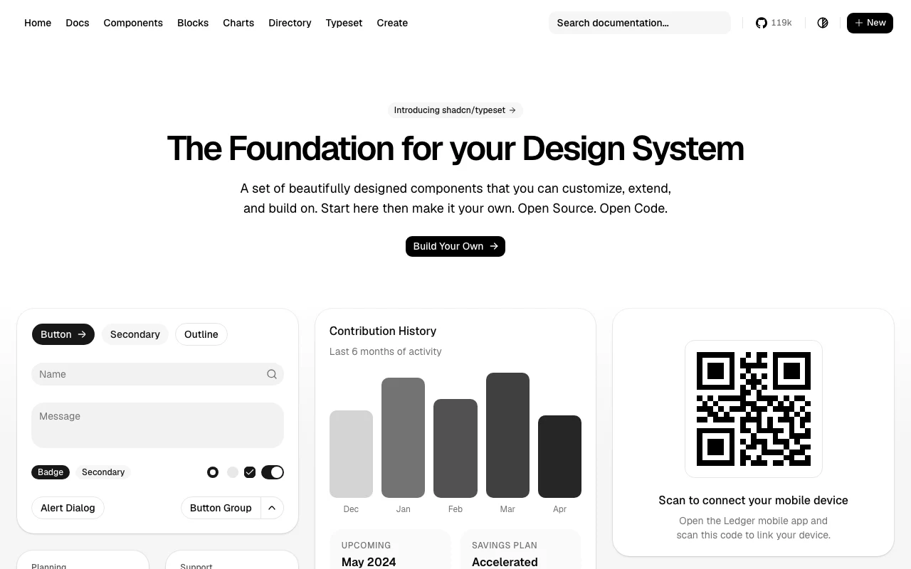
shadcn/ui gives AI agents a component vocabulary — Button, Card, Table, Dialog, Badge — but it does not give them usage rules. When an agent builds a new screen using shadcn primitives without a DESIGN.md file, it makes independent decisions for every visual detail: which Card variant to use, what Button size is appropriate, how much padding the page needs, whether the Table should feel compact or generous. Each decision defaults to the most common pattern seen during training, which is frequently the most generic one. The result is a product that looks like every other shadcn/ui app — not because the components are bad, but because the agent had no information about how your product differs from the default. shadcn/ui's strength is that components are highly customizable; the default look, applied uniformly by an agent with no context, produces a template feeling instead of a product identity. A DESIGN.md file tells the agent which defaults to override, how to combine primitives for your specific product surfaces, and which patterns to explicitly avoid. It is the layer between a capable component library and a product with a distinct visual character.
Documenting theme tokens and density
The first thing to document in a DESIGN.md for a shadcn/ui project is your globals.css token overrides. shadcn/ui uses CSS variables for its design tokens — --radius, --background, --foreground, --primary, --secondary, and so on. If your product sets --radius: 0.375rem instead of the shadcn default of 0.5rem, --primary to a custom HSL value, or --card to a slightly different background, record those exact values and their implications. An agent generating new components will use these tokens correctly when they are documented explicitly rather than inferred. The second thing to document is density preference. shadcn components default to a spacing profile appropriate for consumer apps; many SaaS and developer tools products use tighter density. If your product uses size="sm" on most Button instances, keeps TableCell padding compact, or reduces internal padding in Card components, specify those preferences clearly. An entry like "Default button size in data contexts is sm; use the default size only for standalone primary actions like form submissions" gives the agent a concrete decision rule instead of leaving it to interpret what "compact" means in practice.
## Theme tokens (overrides from shadcn defaults) - --radius: 0.375rem (shadcn default is 0.5rem) — applies to Card, Dialog, Input.- --primary: 222 47% 11% (near-black, not the default blue) — CTAs and active states only.- --card: 0 0% 100% with a 1px border, never a shadow. ## Density - Default button size in data contexts (tables, toolbars) is "sm".- Use the default size only for standalone primary actions (form submits, empty-state CTAs).- TableCell padding: px-3 py-2, not the shadcn default px-4 py-4.Component decisions by surface
For each shadcn component used regularly in the product, a DESIGN.md entry should cover the default variant and size preference, when to deviate from those defaults, and the most important anti-pattern to avoid. These entries are not theoretical — they capture the real decisions your product makes, which an agent cannot infer from the shadcn source code alone.
## Components ### Button- Primary actions: variant="default", default size.- Secondary and inline actions: variant="ghost", size="sm".- Destructive actions: always variant="destructive".- Never use variant="outline" as the sole action in a form — it reads as secondary even when it is the only option. ### Dialog- Confirmation dialogs: max-w-sm.- Multi-field forms in dialogs: max-w-lg.- Never use full-screen dialogs. ### Table- Compact row height in dashboard and list contexts.- TableHead cells: text-xs font-medium text-muted-foreground.- No alternating row backgrounds — use hover state only. ### Badge- variant="secondary" for status labels.- variant="outline" for count indicators.- variant="default" (high contrast) is reserved for alerts, never informational labels.Page-level patterns for shadcn products
Beyond individual components, DESIGN.md should document how shadcn primitives combine into full page patterns. Documenting these layouts explicitly means that when an agent builds a new settings section or a new data view, it has a structural model to follow rather than inventing a layout from scratch. The most common failure in shadcn-based AI code is not wrong component usage in isolation — it is wrong component composition, where the right components are arranged in the wrong structural relationship to each other.
| Page pattern | Structure |
|---|---|
| Dashboard overview | Stats row: 4 compact Cards, one metric + label each. Main area: CardHeader + Table. Sidebar: Card with a distinct background. |
| Settings | Stacked Cards, CardHeader per section title, CardContent for fields. 24px vertical gap between sections — no dividers. |
| Forms | Label + Input pairs, 4px gap. Errors: text-destructive text-sm below the field. Actions right-aligned, primary action last. |
Building a product identity on top of the library
The finish line for DESIGN.md on a shadcn project is a file specific enough that a new agent can generate UI that does not feel like the shadcn starter template. The critical entries are the ones that diverge from shadcn defaults: custom radius values, custom primary color HSL, adjusted density preferences, component variant choices specific to your product type. The point is that the anti-patterns section captures the difference between your product and the library default — the exact gap that agents would otherwise fill with template behavior. A maintained DESIGN.md for a shadcn project lets the team move fast with the library while preserving the visual identity that makes the product distinct. Components stay up to date with shadcn releases; the product identity stays defined in DESIGN.md and is applied consistently whether a human or an agent is doing the implementation.
- No decorative gradients on operational surfaces.
- No hero-style sections inside the app shell.
- No card shadows — border only, using --card and --border.
Use DESIGN.md with a real product reference
Browse curated DESIGN.md examples from product teams, design systems, developer tools, SaaS dashboards, and AI-native apps. Use them as references before your agent builds the next screen.
Related guides
DESIGN.md vs design tokens
Why DESIGN.md complements tokens instead of replacing them.
DESIGN.md for Tailwind CSS
Use DESIGN.md to stop Tailwind-generated UI from collapsing into generic utility soup.
Why AI agents make ugly UI
Most bad AI-generated interfaces come from missing visual context, not weak code generation.
Frequently asked questions
Does shadcn/ui work with DESIGN.md out of the box?
Yes. shadcn/ui components live in your repo, so a DESIGN.md that names variants, sizes, and token values maps directly onto code the agent can edit. Put DESIGN.md in the project root next to components.json.
Should DESIGN.md list my shadcn theme tokens?
List the semantic roles and the values that differ from the shadcn defaults: primary, radius, density rules. Do not paste the whole globals.css — describe intent, then point the agent at the file.
What is the difference between DESIGN.md and components.json?
components.json configures the shadcn CLI (paths, style, base color). DESIGN.md tells the AI agent how to USE the components: which variants, what density, which patterns are off-limits.
How many shadcn components need a DESIGN.md entry?
Cover the six to ten components that appear most often in your product — usually Button, Card, Dialog, Table, Badge, and Input. Rare components can default to shadcn defaults until an agent gets one wrong.